
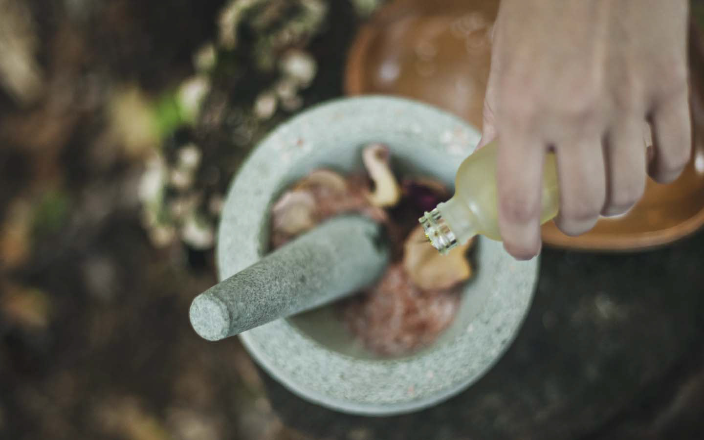
Introducing de l'essence, an exceptional essential oil blend brand rooted in San Diego. Passionate about both the brand and the power of essential oils, de l'essence entrusted us with the task of creating their unique brand design. We embarked on this journey with zeal, pouring our expertise into crafting a brand that embodies their vision, values, and love for nature's aromatic treasures.
de l'essence, meaning "of the essence" in French, perfectly captures the essence of this brand.
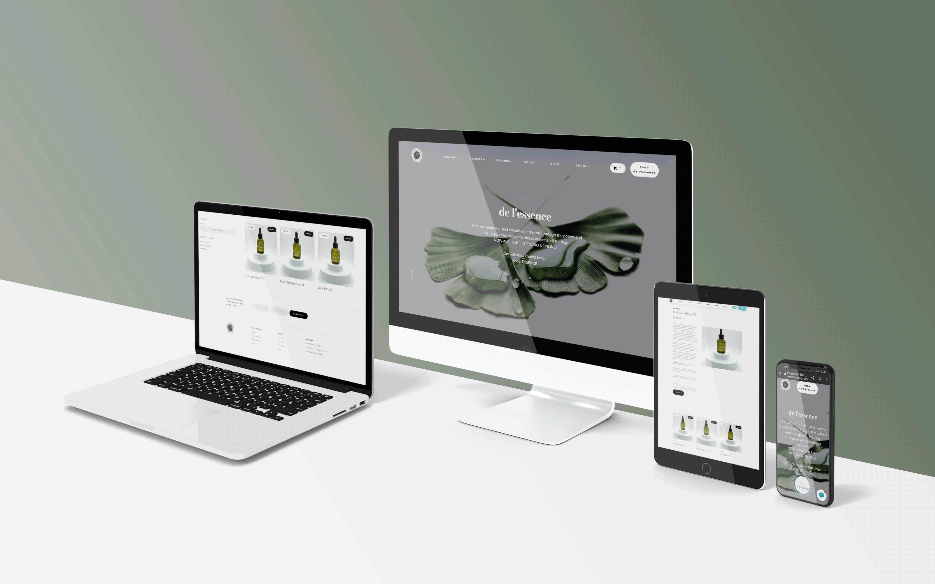
The result is a distinctive brand identity, blending an edgy and contemporary aesthetic with subtle retro elements. This deliberate design choice sets de l'essence apart from other essential oil brands, capturing attention and inspiring curiosity.
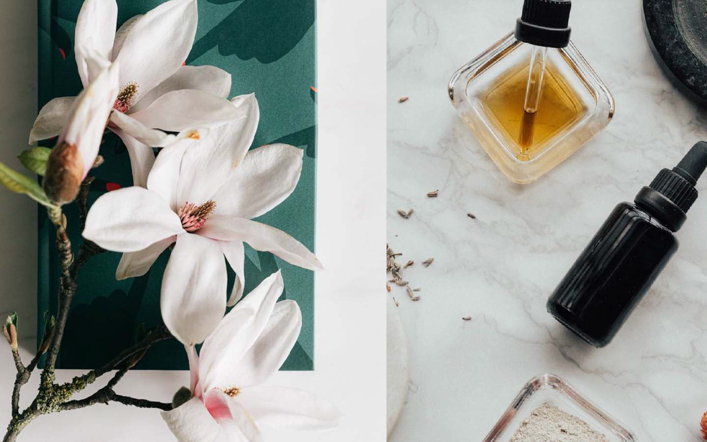
Witness the captivating allure of our carefully curated blends, exquisitely crafted to awaken your senses and empower you on your own unique path.
Creative idea
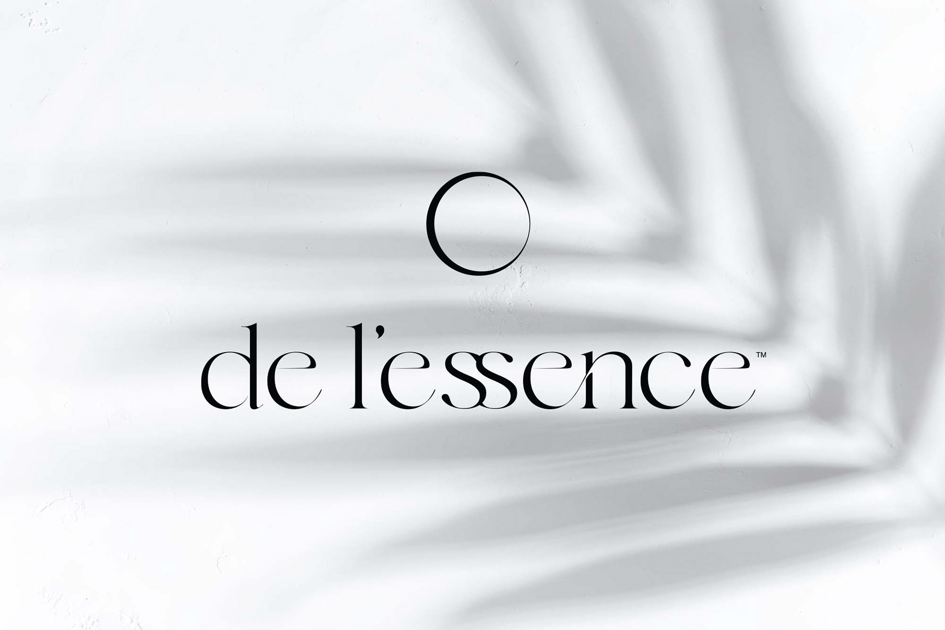
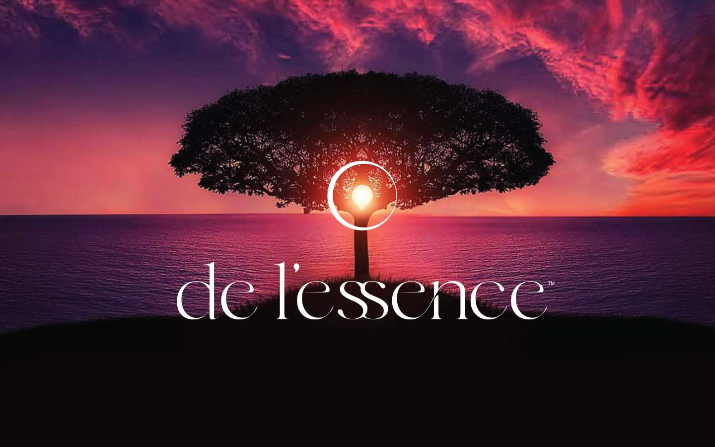
The creative idea behind de l'essence's brand logo is rooted in the concept of embracing the organic beauty of imperfection through the foundational shape of a circle. The circle is a universal symbol that can be found in the sun, moon, and even the structure of electrons, representing a unifying and binding force. The emblem of de l'essence draws inspiration from this fundamental form, symbolizing both the physical representation and the essential core. It serves as a visual embodiment of the brand's main idea, capturing the essence of de l'essence itself.

Brand mood
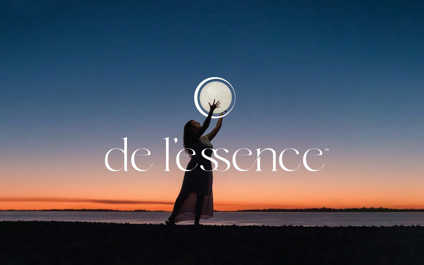
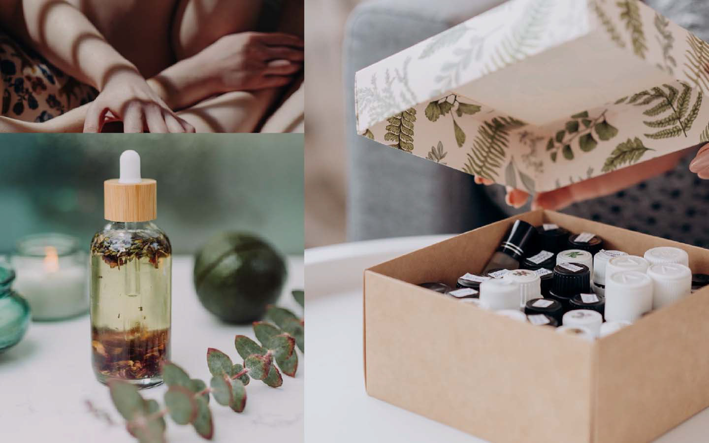
The mood of the de l'essence brand is a harmonious blend of serenity and enchantment. It evokes a sense of tranquility, inviting individuals to embrace moments of self-care and indulge in the transformative power of nature. The brand's essence exudes a subtle sophistication, captivating the senses with its soothing aromas and captivating visual aesthetic. With every interaction, de l'essence inspires a feeling of inner peace, empowering individuals to embrace their unique journey of self-discovery and find solace in the beauty of the present moment.

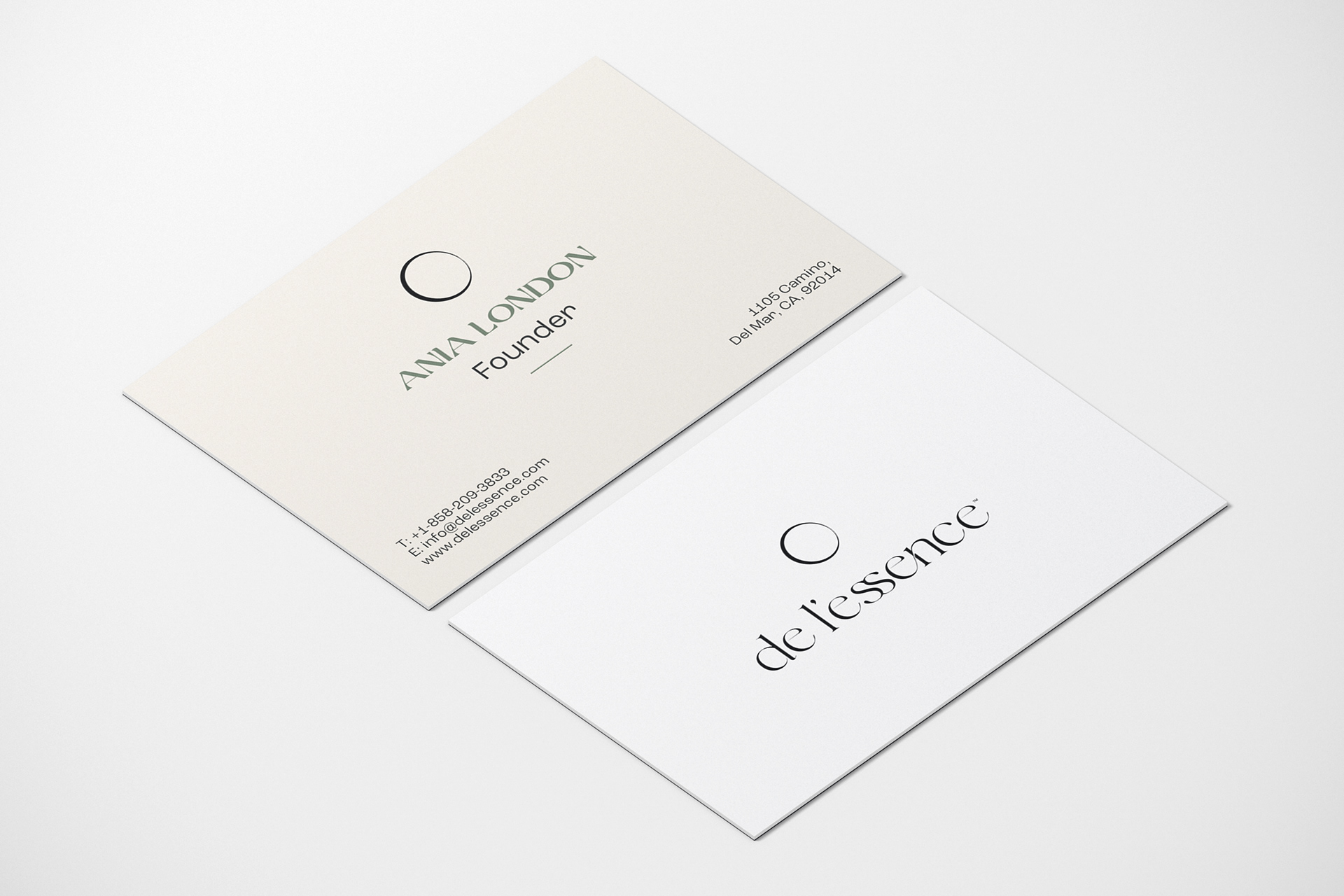
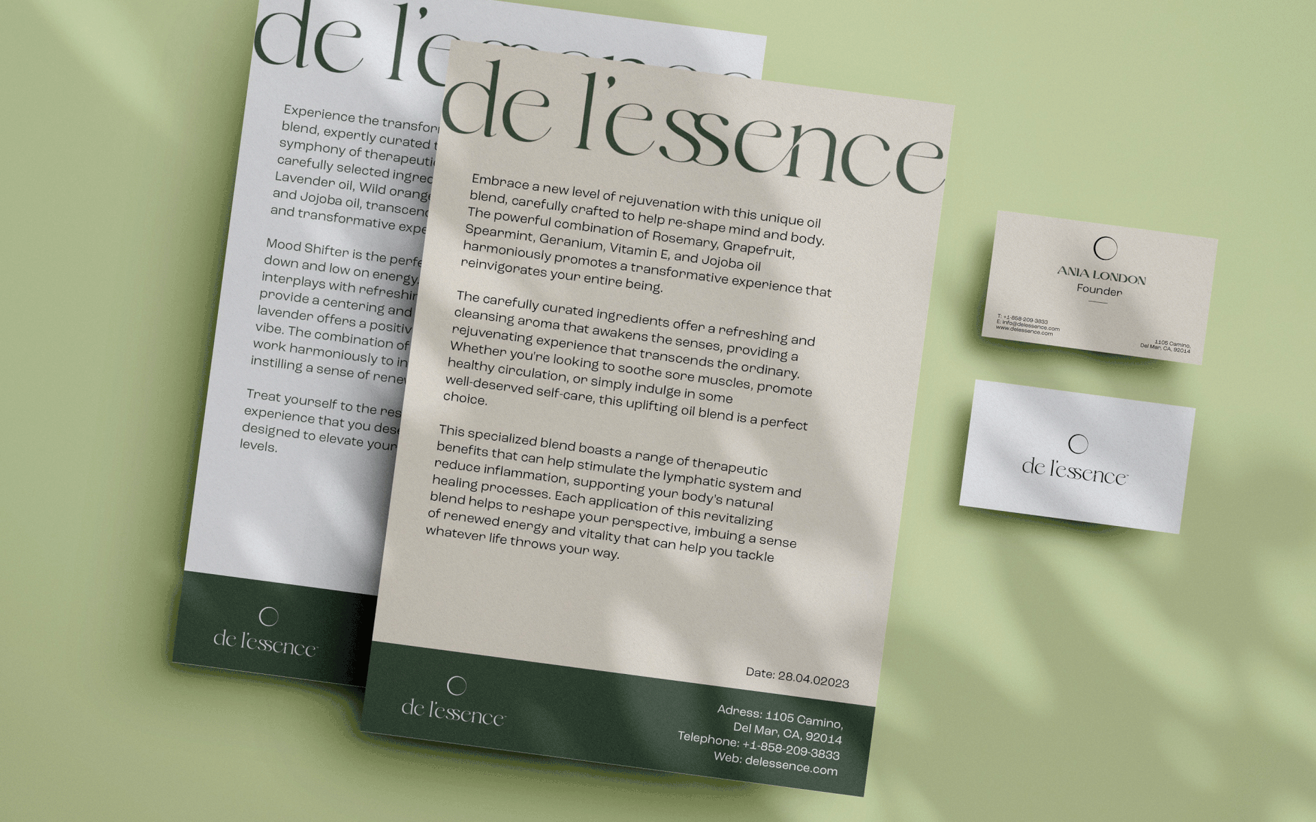
The Logo
At the heart of the logo lies an emblem inspired by the harmonious imperfection of the circle, symbolizing unity and connection. This emblem serves as a representation of the brand's core, capturing its very essence. Accompanied by the stacked logo featuring the distinct and unique font, the logo exudes an air of sophistication and individuality.
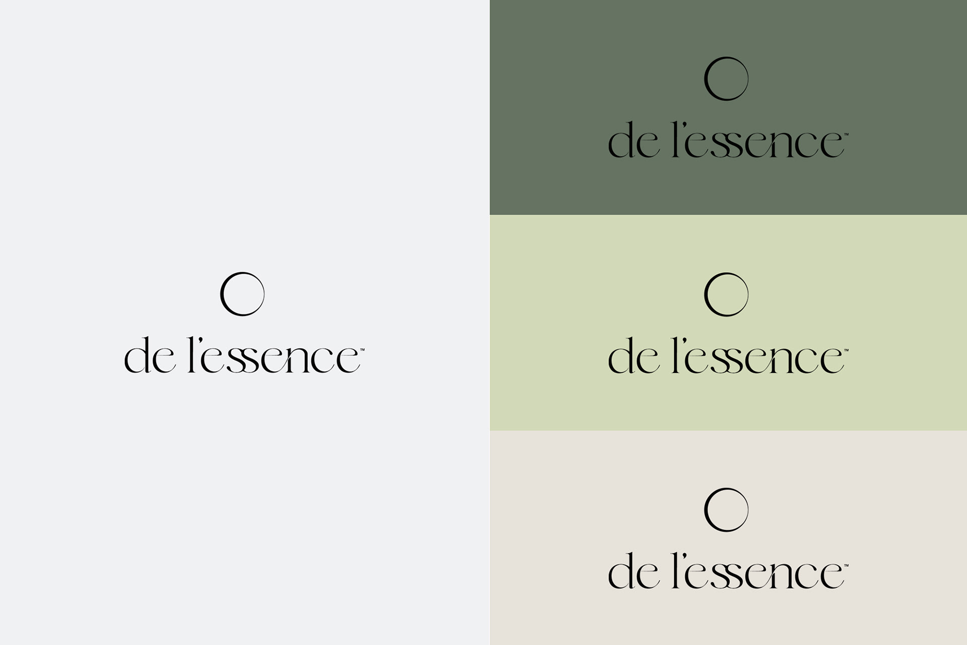
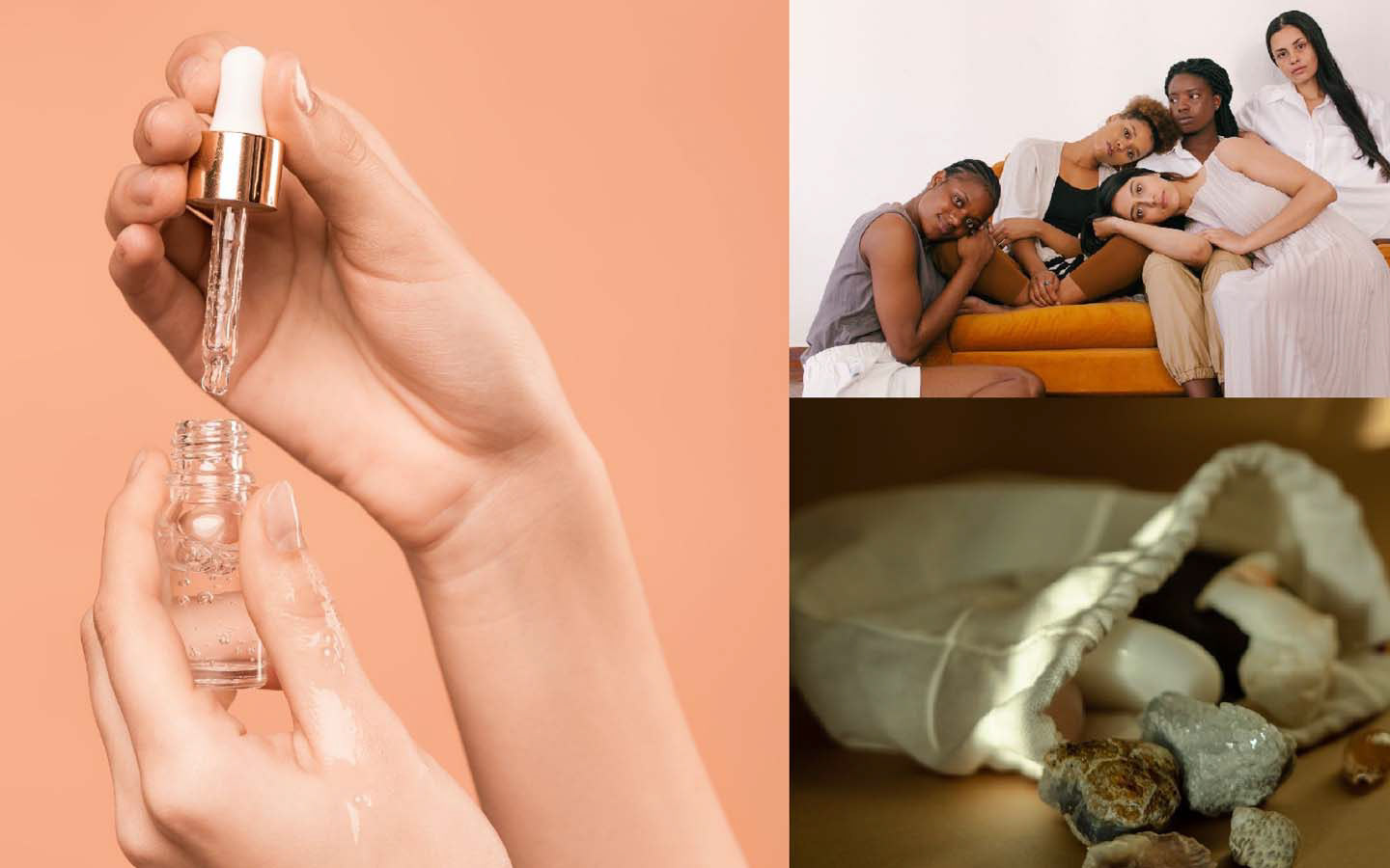
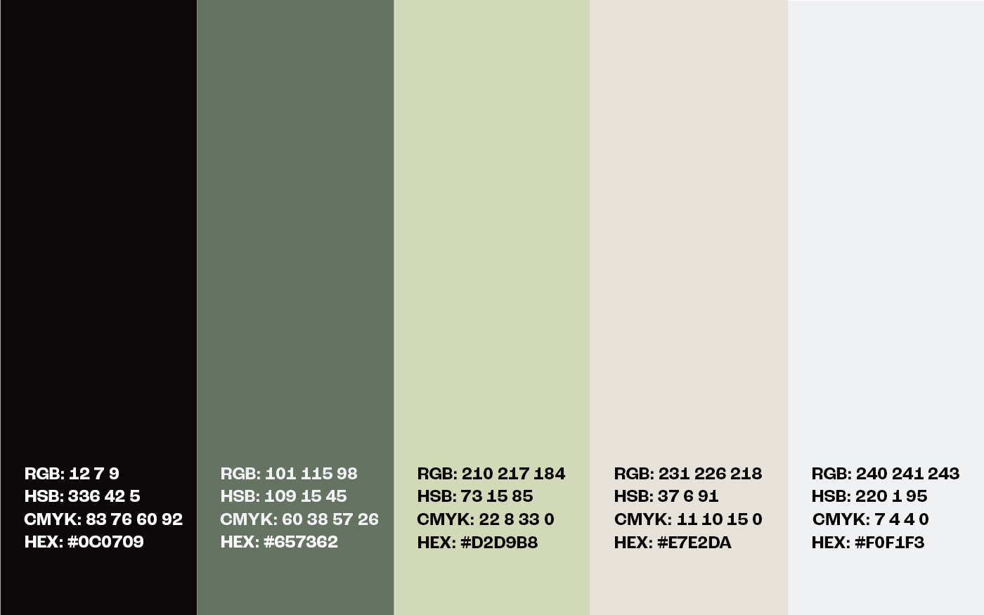
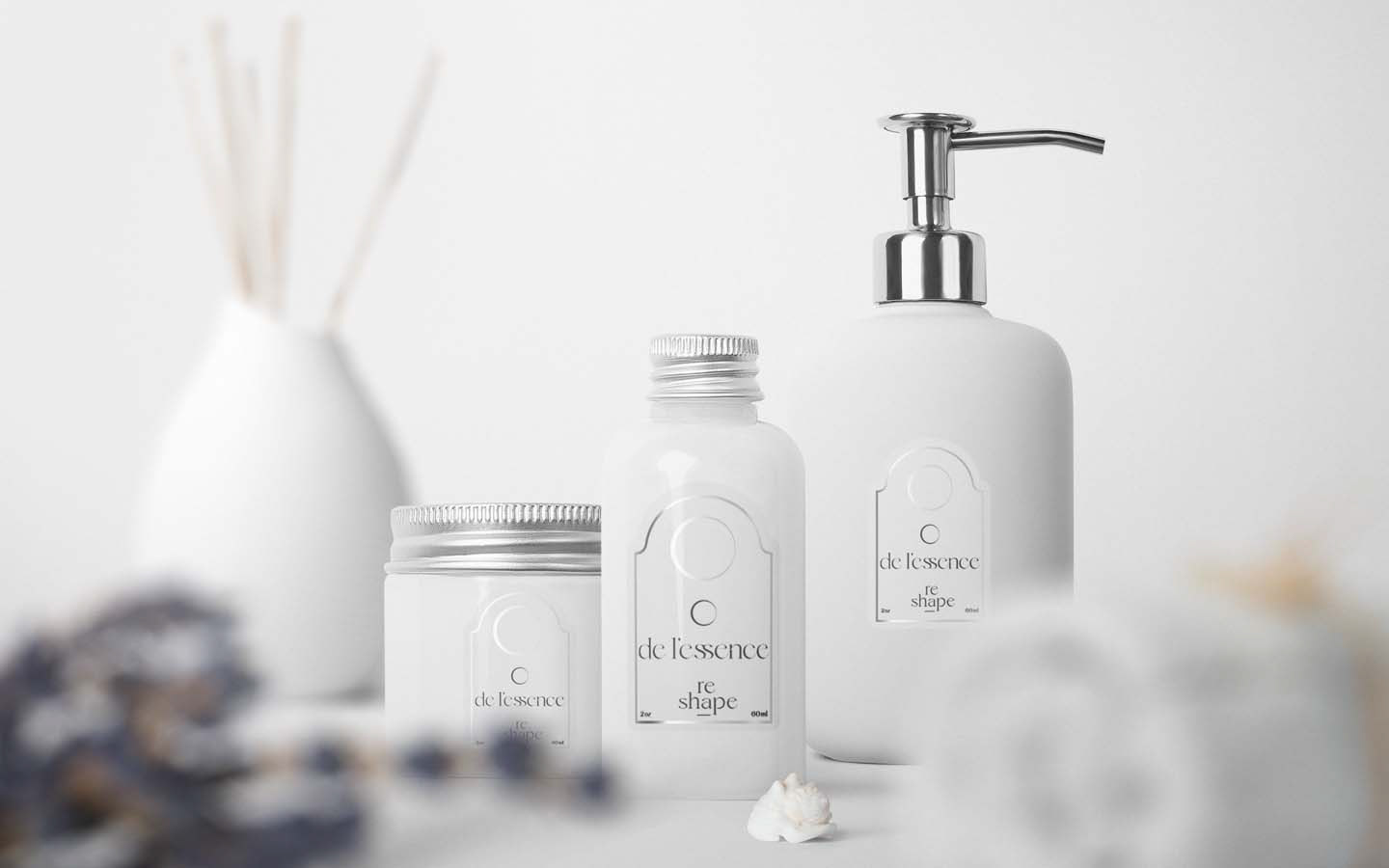
The colors
The soft hues create a gentle and calming atmosphere that mirrors the brand's commitment to promoting self-care and well-being.
The pale tones reflect the brand's desire to create a soothing and nurturing environment, reminiscent of the subtle beauty found in nature.
By utilizing muted and pale colors, the brand invites individuals to slow down, find solace, and create space for self-reflection. These colors harmonize with the brand's vision, enveloping individuals in a calming embrace and encouraging them to embark on a journey of self-discovery and well-being.
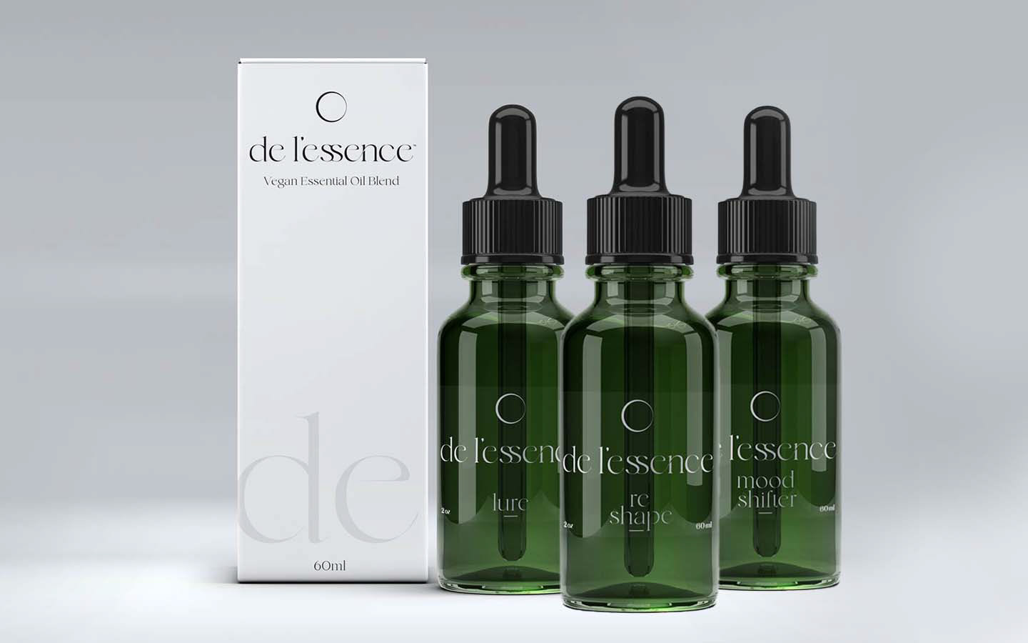
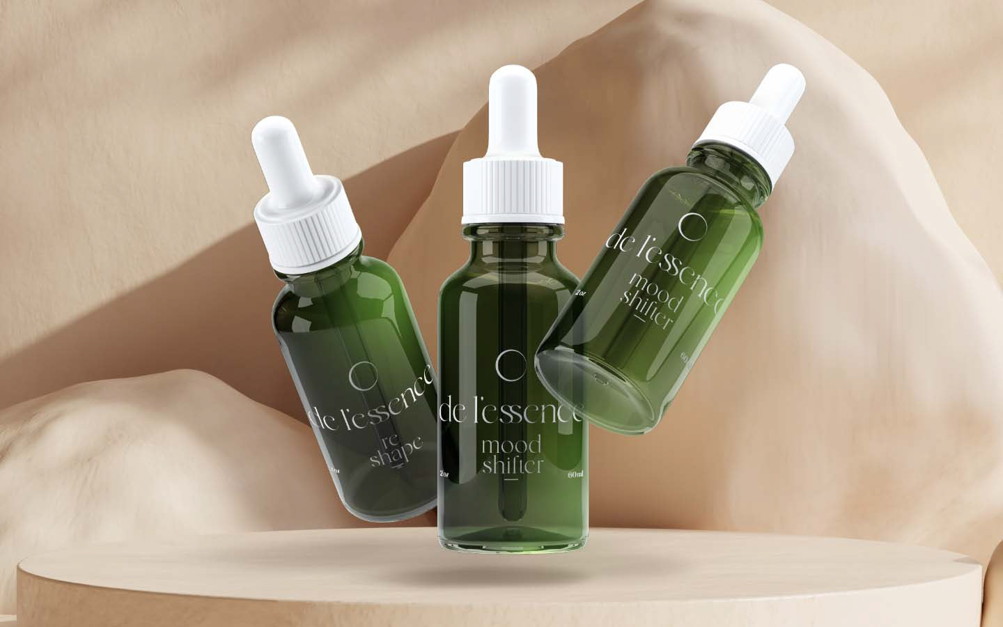
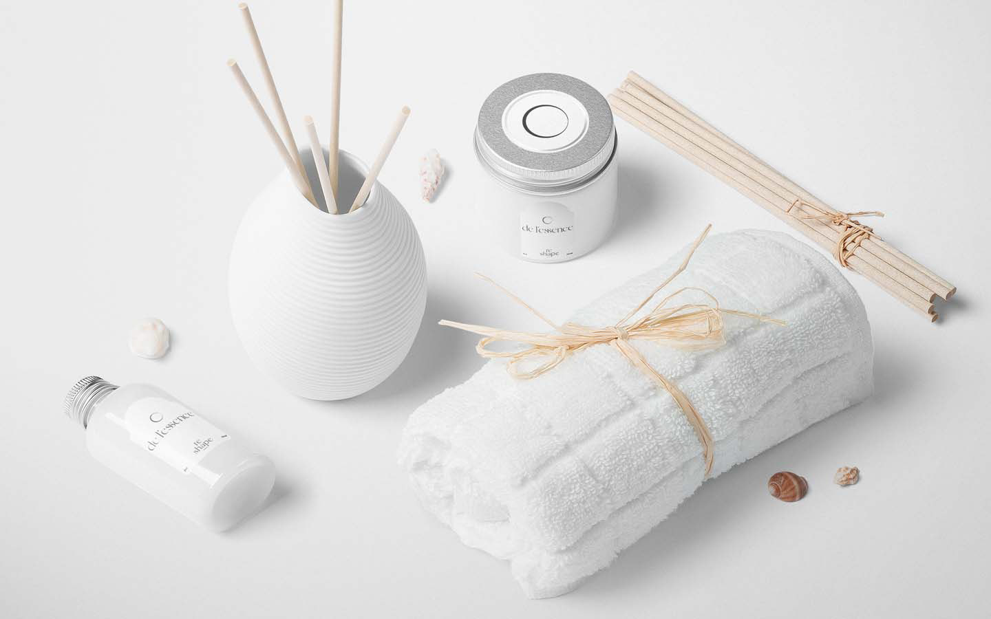
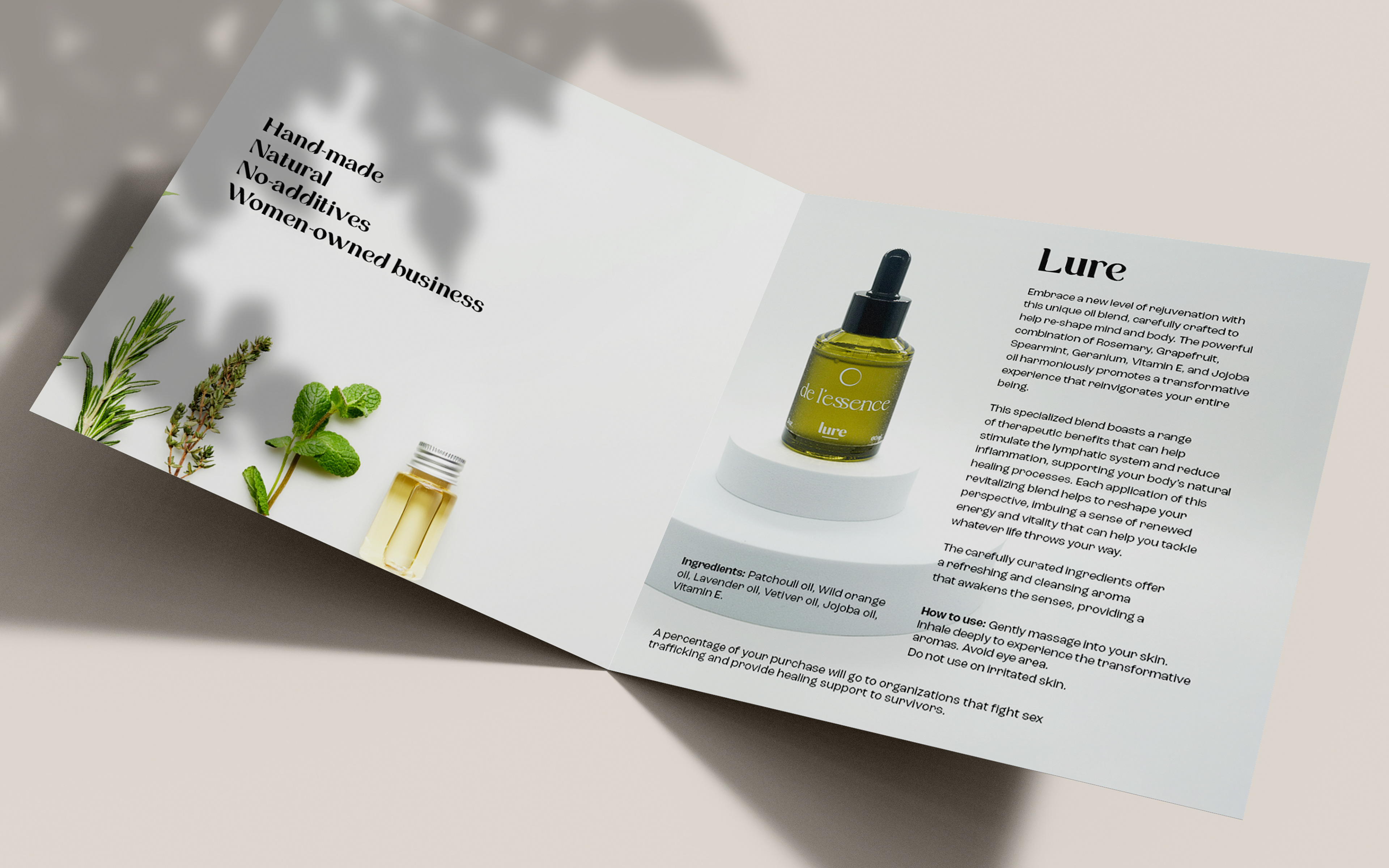
Packaging
The packaging for de l'essence's essential oil blends was thoughtfully crafted to create a cohesive and visually captivating experience. Each bottle features a sleek and elegant design, with a consistent shape and materials that exude a sense of sophistication and purity. The minimalist approach to packaging allows the focus to remain on the essential oil blends themselves, highlighting the brand's commitment to natural and high-quality ingredients.
Client → de l'essence
Agency → Curious Brand
Brand Identity Design → Utkan Başar
Brand Design & Strategy → Seçkin Uysal
Project Manager → Ece Ateş